
PAPER REVIEW! INKING PART 2
If you enjoy art challenges and trying out new art supplies, then this guide might be of use if you’re looking for paper to use with fineliners and paint markers!
These are the papers I've used personally and that are easier to find in Australia. It can be really tricky to source certain materials here, and ordering from overseas can be super expensive/scammy.
I have 7 years experience working in Art Supply retail shops, so I've tried quite a few things over the years and have a lot of technical knowledge to share with you all!
WATERCOLOUR PAPER
My favourite watercolour paper is Arches smooth 300gsm. The smooth surface is amazing for painting with gouache (which is my preferred traditional paint) or inking with fineliners. The surface is very smooth so it won't shred the nibs of your markers, however ink may bleed if you press on the surface too long.

Arches comes in a few textures (smooth, medium, and rough). It can be very expensive to purchase in Australia, but you can buy them per sheet and cut it down to A5/A4 size to save a little money. The smooth texture is good for gouache painting and ink drawing. The medium and rough are good for getting that traditional watercolour texture in your work! Rough is very rough, amazing for when you want that texture to come through.
The weight of the paper will determine how far you can push the wetness of your work. 185gsm is quite thin and will buckle and ripple when too much water is applied. You can pre-stretch your paper to prevent this from happening. A link on how to do that is here:
300gsm paper is the weight I used for my 2018 Inktober pieces. This paper can handle a bit more wetness when working and you may be able to do light watercolour on this without pre-stretching.
640gsm paper is almost like a board. I've used this to do thickly layered acrylic painting, and also detailed gouache painting. It can handle a lot more water before showing wrinkles, and will usually dry down pretty flat. The smooth version of this paper still has a little texture so I don't use it for ink drawing as the nibs will wear down quickly.
Some other brands of watercolour paper I have used and liked are: Fabriano, and Saunders Waterford. There are a lot more Japanese watercolour papers showing up in Australia recently, but I haven’t had a chance to try them yet!
When testing paint markers on watercolour paper and bristol board, I found the results were much better on bristol. The markers created a pilling effect on the watercolour paper, plus the colours dried down much darker and bled.
You can get watercolour paper from pretty much all art stores in Australia (Eckersley's, Jackson's, Senior Art Supplies, Oxlades, The Art Shop)
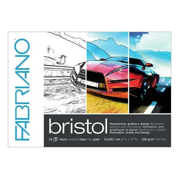
BRISTOL BOARD
The paper I used for my Greek Goddesses Inktober! I found bristol paper worked better with the paint markers as it doesn't absorb ink and paint like watercolour paper does.
Even though it's called a board, Bristol is more like a light card with a very, very, smooth surface. I find that it's nice to ink with, but can sometimes cause the black to come away when erasing the pencil sketch lines. A light touch when using an eraser on this surface will give better results.
The brand I'm using this year is Fabriano because I had a stash of it in my draws from when I worked in the art store. Bristol also works very well with copic markers as it's designed to prevent bleed.
You can get Bristol paper from Eckersley's, Officeworks, and The Art Shed Online.
SCREEN TONE
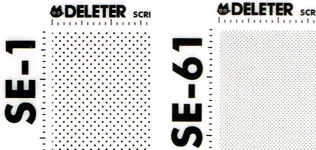
Buying screen tone in Australia is pretty much impossible. I managed to find a Japanese shop that is in English and also ships internationally here: http://deleter-mangashop.com/ Prices are in USD so keep that in mind when ordering from other countries.
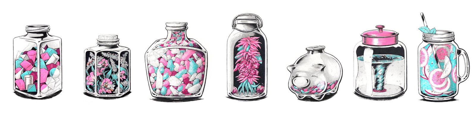
I used screen tone for my Inktober “Jar” Series.
The way this works is quite intensive. Here's a blog post on how to use this by my friend Zthecreative https://www.zthecreative.com/blog/2018/2/9/artists-guide-how-to-use-screentone-paper-traditionally
For a really cool video of a master using this technique, watch this! https://www.youtube.com/watch?v=HCsY2WDbtoI